art
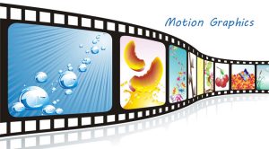
What Motion Graphics Entails

WHAT MOTION GRAPHICS ENTAILS
What motion graphics entails. These are visuals that move. It’s the simplest definition conceivable. The relationship between movement and design aspects is made easier to understand by the fact that motion graphics is frequently also referred to as motion design. The goal of motion graphics is to apply design principles to new media by incorporating time and space to produce movement. However, it’s not easy to make design pieces come to life. In contrast to other animation disciplines, there is no set or “natural” method for animating objects or things.
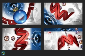
MOTION GRAPHICS
Motion graphics have become a powerful medium for visual storytelling, captivating audiences with dynamic animations, stunning visuals, and seamless integration of text and graphics. In this article, we’ll dive into the fascinating world of motion graphics, exploring its origins, applications, and the creative possibilities it offers.
What does it mean?
Animated graphics that combine sound, visual effects, and movement to improve narrative, elicit strong feelings, and transmit information are called motion graphics. As opposed to conventional animation, which frequently include characters and storylines. They are are primarily concerned with animated graphical elements—such as typography, shapes, and imagery that provide captivating visuals.
Origins of Motion Graphics
They have their origins in the early stages of cinema. where moving images were produced using methods like optical effects and stop-motion animation. With the advent of computer technology and digital animation software in the late 20th century. It evolved into a distinct art form, finding applications in film, television, advertising, and digital media.
Applications of Motion Graphics:
Many different media outlets and sectors use it, including:
1. Advertising
MOTION GRAPHICS
They are a popular choice for advertising campaigns, allowing brands to convey messages and showcase products in visually compelling ways. From animated logos to explainer videos, it help brands stand out and engage audiences in crowded markets.
2. Film and Television
WHAT MOTION GRAPHICS ENTAILS
It plays a crucial role in film and television productions, from title sequences and visual effects to informational graphics and animated infographics. They help set the tone, enhance storytelling, and create immersive viewing experiences for audiences.
3. Digital Media
In the digital age, motion graphics are everywhere, from social media posts and website banners to online presentations and interactive content. They grab attention, convey information quickly, and drive engagement, making them an essential tool for digital marketers and content creators.
4. Education and Training

They are also used in educational and training materials to explain complex concepts, visualize data, and engage learners. Animated tutorials, instructional videos, and interactive simulations help make learning more accessible and engaging.
Creative Possibilities:
One of the most exciting aspects of it is its creative versatility. With the right tools and imagination, it’s artists can bring virtually any idea to life. From abstract animations and experimental art to corporate branding and commercial projects, the possibilities are endless.
Motion graphics artists use a variety of software tools, including Adobe After Effects, Cinema 4D, and Blender. To create stunning visual effects, intricate animations, and seamless motion sequences. They combine design principles such as typography, color theory. And composition with animation techniques such as keyframing, easing, and timing to craft compelling motion graphics.
Summary
Motion graphics are a dynamic and versatile medium for visual storytelling, offering endless creative possibilities across industries and media platforms. Whether you’re a seasoned animation graphics artist or just starting out. Exploring it’s world opens up a world of creativity, innovation, and artistic expression. So grab your tools, unleash your imagination, and dive into it’s exciting world!


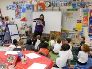
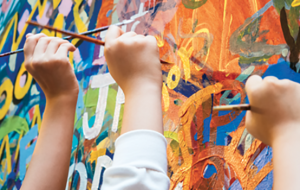
Benefits of teaching arts education. Through the integration of artistic disciplines to improve learning across the curriculum and create well-rounded individuals, arts education teaches subjects like music, drama, dance, and visual arts (drawing, painting, sculpture) to foster creativity, critical thinking, cultural awareness, and problem-solving abilities. It goes beyond technical proficiency to promote social and emotional development, providing all-encompassing experiences that increase motivation and equip students for challenging global issues by encouraging creativity and community involvement.
BENEFITS OF TEACHING ARTS EDUCATION
By fostering creativity, critical thinking, and motor abilities as well as increasing academic performance, mental health, and social skills, teaching arts education promotes overall student development. By encouraging pupils to see errors as teaching opportunities, it fosters resilience, self-assurance, and a growth mentality. Additionally, arts education fosters empathy, cultural understanding, and useful, transferable skills like problem-solving and teamwork, all of which are essential for future professional success.
1. Further improvement and creativity;

In addition to building creativity and invention abilities that are useful in a variety of academic subjects and future occupations, art education gives pupils the chance to express their thoughts and feelings in original and inventive ways.
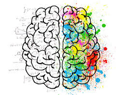
2. Positive effects on brain development;
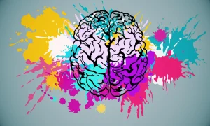
This have been demonstrated by research on the subject of art education. Students’ brains develop holistically when they participate in art-related activities because they activate several brain regions, including the motor and visual areas.
3. Knowledge of Cultural Diversity;
teaching arts education
Art is a useful instrument for learning about and appreciating various cultures. Students gain knowledge of the artistic mediums, fashions, and customs of many countries through art education, which promotes cross-cultural understanding.
4. Delivering critical thinking;
teaching arts education
Critical thinking and visual information analysis are fostered in art education. Through art, kids are able to develop critical thinking abilities that are beneficial in many facets of life, such as asking questions and making judgments.
5. Emotional Intelligence;
Students may express and control their emotions in a positive and healthy way through art education. Students can explore their ideas and grow in self-awareness, and find authentic ways to express themselves via art.
6. Advances mental health;
teaching arts education
Students who may be dealing with stress, anxiety, or other mental health issues can find solace in art lessons offered at schools. Students can express themselves safely and constructively by channeling their emotions via art instruction. As a result, they may experience improved mental health outcomes and be able to better control their emotions. They may also feel more accomplished and valuable. improvements for overall motivation, thinking, and academic achievement.
Summary
Art education is still frequently seen as an elective or extracurricular activity, despite evidence showing that it has many positive effects on mental health, brain development, cultural awareness, general learning, and more. Let’s examine ten reasons why art education is essential to students’ entire development.


Paint colors for living room. A space where one can unwind, read, watch, listen to music, or socialize with loved ones after a long day. The living room serves as our home’s social center, just as its name suggests. Your choice of paint is crucial to creating the ideal ambiance in our living rooms, which have a lot to offer. Living rooms are the perfect place for non-reflective matt surfaces, which provide a cozy and comforting atmosphere. Our matte finishes provide the most color options, whether you want to go for a soothing neutral or dare to be daring.
PAINT COLORS FOR LIVING ROOM
Popular neutrals like warm whites, creams, grays, and beiges are the ideal living room paint colors for a classic and adaptable style. For greater effect, try bolder hues like royal blue, olive green, or even dark browns and burgundies. Warm options like sunny yellow or a sandy gray-beige will create a homey ambiance, while softer tones like sage green or pastel blue will feel serene and airy.
1. Moon Lily;
Try Moon Lily ( paint) again if you don’t think purple looks good in a tiny bedroom. Your living area will feel cozier with this alluring purple’s gorgeous hazy texture. Even though the color is vibrant, it’s subdued, so it won’t overpower a tiny space. Even experimenting with tonal decorating is an option.
Color layering can work wonders for your small living space as long as you match this shade with muted hues and colder tones.
2. Bare Pink;

paint colors for living room
Don’t believe that pink belongs exclusively in the bedroom. Any tiny bedroom would benefit from the bright addition of bare pink. This subdued hue, which combines floral undertones with a touch of cerise, can warm up your living area while remaining sufficiently light to assist give the impression of more space
You can paint a complete living space with this rather than the typical neutral colours because it’s so subtle. But you can also draw some inspiration for your own palette from those flowery undertones.
Consider utilizing a fuchsia or another stronger pink for a feature wall. Do you want to give your living space a more sophisticated look? Blush pinks and jewel tones can also be effective.
3. Enduring Ice;

paint colors for living room
If you’re arranging a smaller living space, cool tones are also something you should consider. Try an off-white like Enduring Ice; its sage tones will infuse any decor with a calming vibe. Don’t be afraid to use warmer color schemes in your living area to create a cozier atmosphere. This enticing ice tone goes well with honeyed neutrals and subdued florals
4. Grey Glimpse;

paint colors for living room
Are you having trouble deciding on the ideal wall color for your modern living room? Even in cases where square footage is a concern, Grey Glimpse will look great in minimalist interiors. This gorgeous paint color has a dreamy before-dawn vibe and is cool and pleasant. Combine this hue with light-colored furniture and minimalist decorations to maximize your available space. Are you eager to add additional color to your living room? This neutral goes well with cool tones like blue and green, but you can also add warmth by mixing in shades that have floral undertones.
Summary
We’ve compiled the top living room color ideas to get you started, whether you’re planning a full living room makeover or just want to give the room a new look with some paint. From classic neutrals like cream, beige, and gray to more vibrant hues like pink, blue, yellow, and green, you can find chic living room paint ideas.

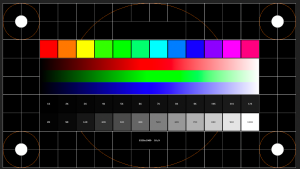
Colour calibration and grading differences. Simply put, color calibration ensures that everything is set up to print or publish content as it appears on your screen. HSL is used to precisely regulate particular colors. For instance, you can tone down a red structure that is very saturated. You can add more saturation or darken a blue sky if it’s too light. With its origins in film, color grading is primarily about applying stylistic tones to the brights, mids, and shadows (typically but not always).
COLOUR CALIBRATION AND GRADING DIFFERENCES
Color is a fundamental aspect of visual media, influencing how we perceive and interpret images and videos. In the realms of photography, filmmaking, and graphic design, two terms frequently arise: color calibration and color grading. While they both involve manipulating color, they serve distinct purposes and play different roles in the creative process.
1. Color Calibration:
Ensuring Accuracy and Consistency
Colour Calibration and Grading Differences
Color calibration is the technical process of adjusting and standardizing the colors displayed on a monitor or other display device to ensure accuracy and consistency. It involves using specialized hardware and software to measure and adjust various color settings such as brightness, contrast, gamma, and color temperature. The objective of color calibration is to ensure that the colors displayed on the monitor match the colors as they appear in real life or as intended by the content creator.
In practical terms, color calibration is crucial for tasks such as photo and video editing, where color accuracy is paramount. By calibrating monitors, professionals can trust that the colors they see on screen accurately represent the colors in their images or videos. This ensures that their creative decisions are based on reliable visual feedback, leading to more consistent and accurate results across different devices and platforms.
2. Color Grading
Unleashing Creativity and Style

Colour Calibration and Grading Differences
Color grading, on the other hand, is the creative process of manipulating and enhancing the colors of a video or image to achieve a desired aesthetic or mood. Unlike color calibration, which focuses on technical accuracy, color grading is an artistic endeavor that involves adjusting parameters such as exposure, contrast, saturation, hue, and color balance to create a cohesive and visually appealing look.
Color grading can serve multiple purposes, including correcting technical issues in footage, such as white balance or exposure problems, as well as stylizing and enhancing the overall visual presentation. It is a highly subjective process that often requires a deep understanding of color theory, storytelling techniques, and the intended emotional impact of the visual content.
Summary
Color calibration and color grading are both essential components of the creative process in visual media. While color calibration ensures the accuracy and consistency of colors displayed on monitors, color grading allows creators to unleash their creativity and style, enhancing the visual impact of their work. By understanding the differences between these two processes, professionals can effectively balance the technical and artistic aspects of color manipulation, ultimately producing visually stunning and emotionally resonant content.

Capable God Lyrics

Glorious God Lyrics

Ancient of Days Lyrics

A Step-by-Step Guide to Deleting Reels on Instagram

How to Create a WhatsApp Group